 Free toolStitch density calculatorConvert stitch spacing to lines per inch and stitches per square inch, and estimate a design.Open the tool
This guide is for anyone digitizing filled shapes, by hand or with an auto-digitizer, who wants to know which way the rows should run and why it matters. You'll get the reasons behind the 45° default, how to angle neighboring areas, leaves, petals and fur, which angles to avoid on knits and long shapes, and how the angle decides where a fill pulls in.
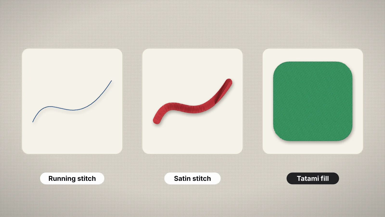
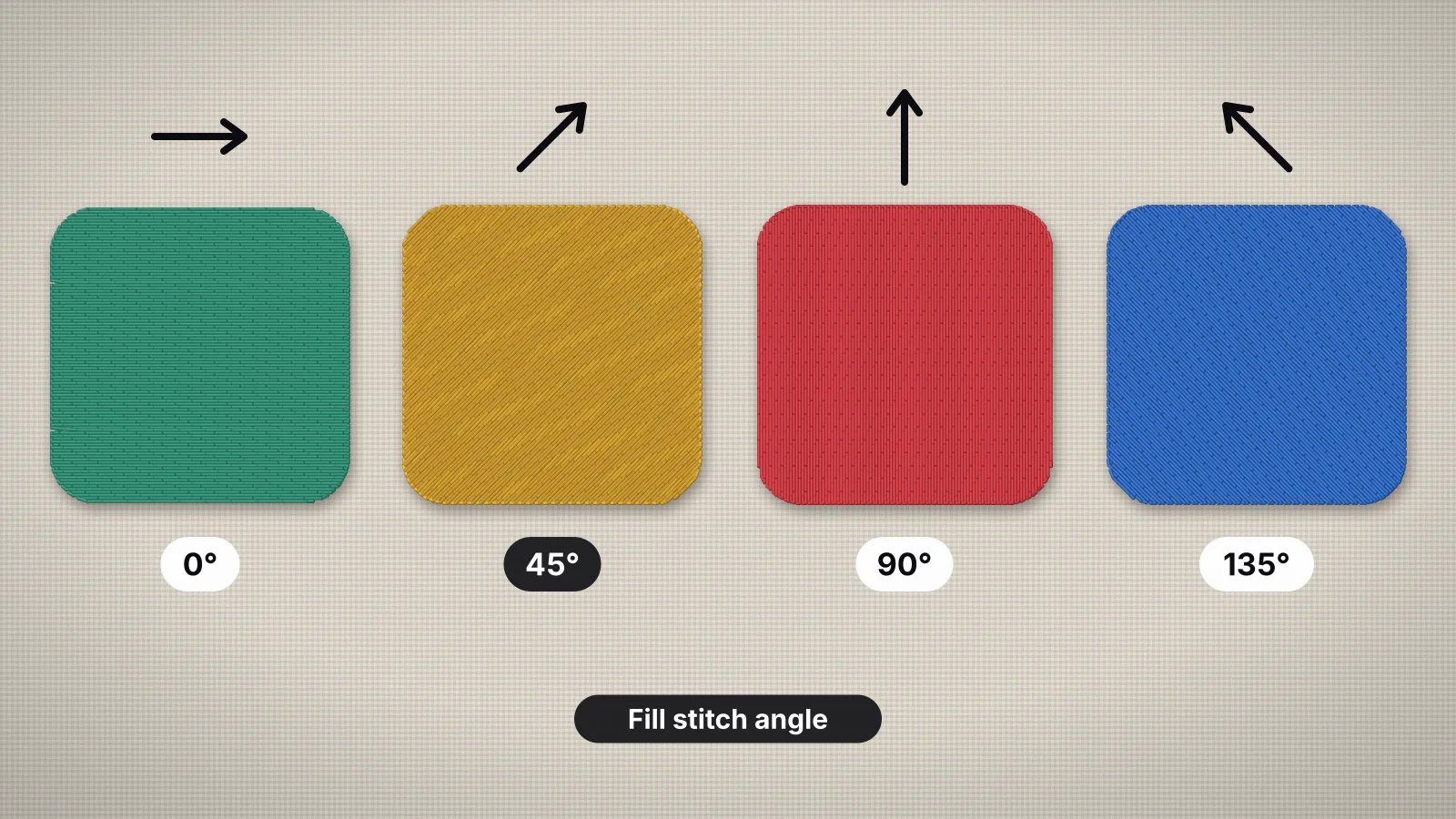
It assumes you know what a tatami fill is: the stitch types guide covers that, and the density guide covers row spacing. Angles follow the convention most programs use, where 0° is rows running straight across and 90° is rows running straight up and down.
What does the fill stitch angle change?
The fill angle changes how an area catches the light, how light or dark its color looks, which way the fabric is pulled in and how many sections, travel runs and trims the fill needs. It barely changes the stitch count, because the same area at the same spacing needs about the same number of stitches at any angle.
| What changes | What you see |
|---|---|
| Sheen | Thread is shiny along its length, so rows in different directions reflect the light differently: one area glows while its neighbor looks matte |
| Perceived color | The same thread reads a shade lighter or darker depending on the angle, and the two swap as the garment or the light moves |
| Pull and push | The fill pulls in along its rows and spreads slightly across them, so the angle decides which edges gap |
| Edges | Edges the rows end on are formed by crisp row ends; edges running almost parallel to the rows can look stepped |
| Sections and trims | A C or U shape filled one way may sew as one section and the other way as three, with travel runs or trims between them |
That makes the angle a design decision as much as a technical one. On a one-color logo it's the only thing that separates one area from the next, and on a photo-style design it's what gives flat thread a sense of shape. The stitch angle entry has the short definition.
Why is 45° the default fill angle?
45° is the default because a diagonal fill stays off the fabric's grain, meets the horizontal and vertical edges of most artwork at a clean angle and shares its pull between both directions of the fabric. Brother's PE-Design manuals, for example, list 45° as the default fill direction, and most digitizers start there.
- It stays off the grain. Woven fabric has threads running lengthwise and crosswise, and knits have ribs running lengthwise. Rows that line up with either can sink between them, and their pull lands on one direction of the fabric. A diagonal splits it between both.
- It meets straight edges cleanly. Most logos are full of horizontal and vertical edges: text baselines, boxes and banners. At 45°, every one of those edges is formed by row ends at a clear angle.
- It's predictable. With fills at 45° and 135°, a design reads as one surface, and you only change the angle where you want contrast or flow.
45° is a starting point, not a rule. A banner that slants at 45° would have its rows running along its length, so give it 135° and the rows cross it instead. Natural shapes look best following their growth, as below, and a fill can sew in fewer pieces at another angle.
Try it with your own design
Sign up free, upload an image and get a stitch preview in under a minute.
Drop your image here
PNG, JPG, SVG, PDF or AI · stays on your device
Not sure what to expect? See real examples or how it works.
Which angles should neighboring areas use?
Give touching areas angles at least about 45° apart, and 90° apart when they're the same or a similar color, such as 45° and 135°. Fills at right angles catch the light in opposite ways, so even in one thread color they read as separate shapes.
- Same color, two areas. A tone-on-tone logo, a one-color badge or a self-colored logo on a cap depends entirely on angle contrast. 45° against 135° gives the strongest difference while keeping both fills off the grain.
- Different colors. The angle matters less, but alternating still helps. A change of direction at the boundary makes the edge read sharper, and similar shades such as navy and black stay distinguishable.
- Fill on fill. Where one fill sits on another, set the two at different angles so the top rows lie across the ones underneath rather than dropping between them. Large top shapes are better cut out of the fill below, which also saves stitches.
- Underlay. The same idea works under a single fill: tatami underlay is usually laid at right angles to the top rows. The underlay guide covers the types.
Look at the whole design, not just pairs. Seven fills all alternating look busy, so keep areas that belong together, such as all the letters of one word, at one angle, and alternate between groups.
How do you angle fills to follow a shape?
Run the rows the way the real thing grows or flows: out from the midrib of a leaf, toward the center of a flower and in the direction fur lies. The sheen then changes across the design the way light moves over the real object, which makes a flat fill look shaped.
- Leaves. Angle the rows from the midrib out toward the edge, like veins, and mirror the angle on each half, such as 45° on one side and 135° on the other. Digitize the halves as separate areas so each can have its own angle.
- Petals. Point the rows of each petal toward the flower's center, so the petals radiate. Each petal is its own area with its own angle.
- Animal fur and hair. Follow the way the fur lies: back from the nose across the face, down the body and down the legs. Split the animal into areas where the direction changes, such as the face, the ears and the body.
- Feathers and wings. Angle the rows out from each feather's shaft, the way the barbs grow.
- Water, sky and landscapes. Rows close to horizontal read calm and level, and a slightly different angle in each band of sky or water separates them without extra colors.
Desktop digitizing software can also turn the angle inside a single shape, with turning fills or several stitch angles in one object, or curve the rows with a contour fill. Those take hand digitizing. With one straight angle per area, the technique is to split shapes wherever the direction should change, then check the result in a sew-out simulator or a test piece.
Which fill angles should you avoid?
Avoid rows parallel to the ribs of a knit, rows along the length of a long, narrow shape, rows almost parallel to a long straight edge and angles that cut a shape into many sections. Each one makes the fill pull, sink or step in a way a different angle would prevent.
- Parallel to knit ribs. On a T-shirt, sweater or rib cuff the ribs usually run up and down, so 90° rows sit along them. A line of needle holes down one rib can drop the stitches into the groove beside it and cut the yarn. Straight across isn't ideal either, because that's the direction jersey stretches most. A diagonal splits the difference; how to embroider a T-shirt covers the backing.
- Along a long, narrow shape. A stripe, a band or a wide letter stroke filled lengthwise becomes a few very long rows. The pull shortens the shape, push spreads it wider than drawn, and the long edges are formed by the side of a row instead of crisp row ends. Run the rows across it at a slant, roughly 45° to its length, the way a satin would cross it.
- Almost parallel to an edge. Rows a few degrees off a long straight edge end in long, uneven steps along it. Line the rows up with the edge exactly, or turn them well away from it.
- Angles that cut a shape into pieces. A C, U or crescent filled across its opening breaks into several sections, each joined by a travel run or a trim. Turning the angle often sews it in one or two.
Check which way the ribs run under the design, not on the screen. On a sleeve, text that reads along the arm has the ribs running along its baseline, so 0° in the design sits parallel to them.
How does the fill angle affect pull compensation?
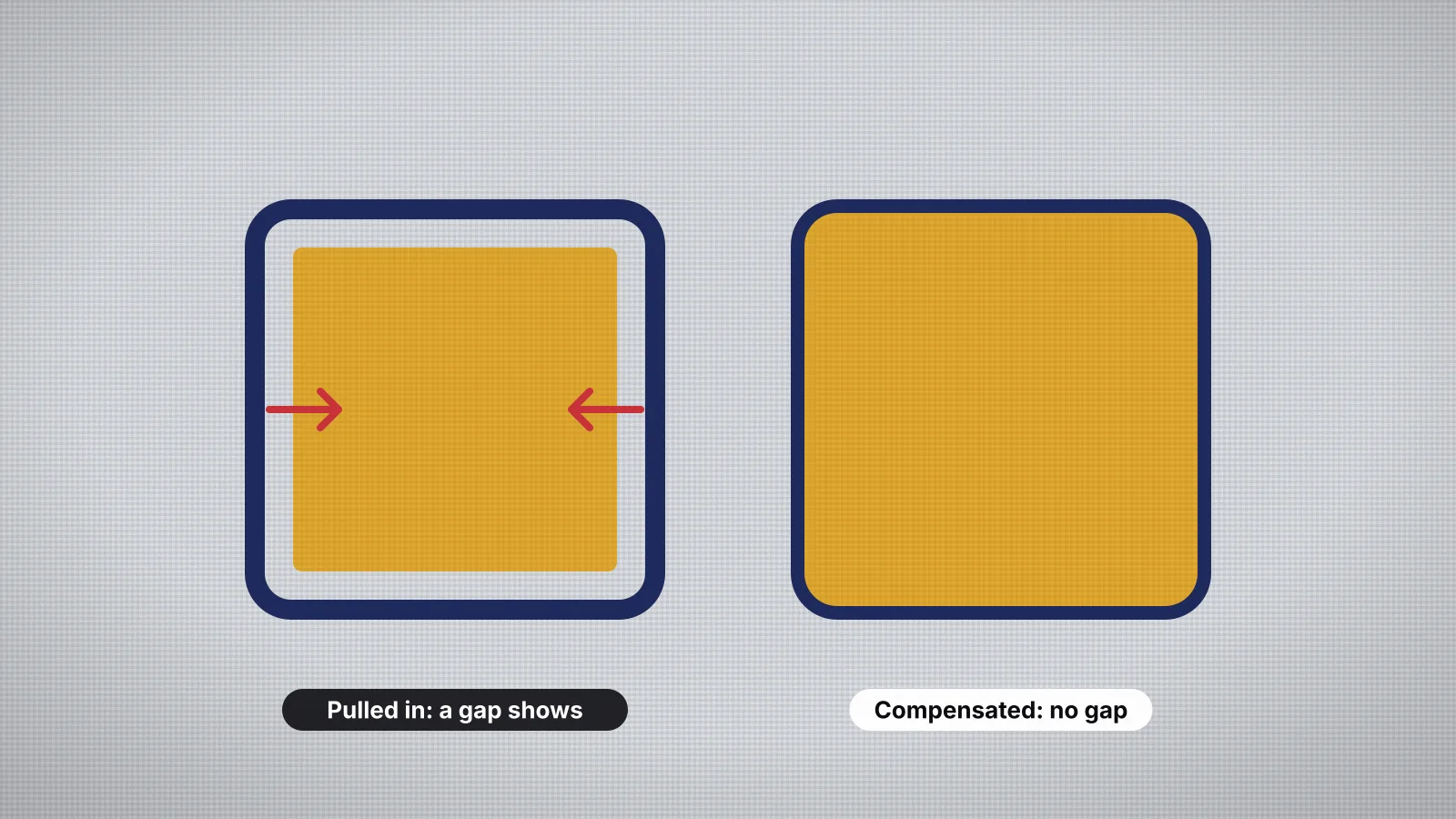
A fill pulls the fabric in along its rows and pushes it out slightly across them, so the angle decides which edges shrink and which spread. Pull compensation lengthens each row at both ends to make up for it, which means it acts only on the edges the rows end on.
- Gaps on two opposite sides. If a fill sewn at 0° leaves a gap to its outline on the left and right but not at the top and bottom, that's pull along the rows. More pull compensation fixes it; knits usually need about 0.3 mm per side where stable wovens take 0.2 mm. How to fix gaps covers the other causes.
- Shapes that change proportion. A circle filled at 0° sews slightly narrower and taller than drawn, and at 90° wider and shorter. At 45° the stretch runs along the diagonal. Expect it, and check round shapes in a test sew-out.
- Neighbors at different angles. Two touching fills at 45° and 135° shrink away from their shared edge in different directions. That's why lower colors are digitized to run slightly under the ones on top, and why contrasting angles need that overlap.
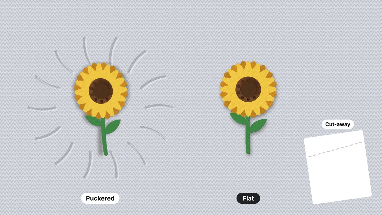
- Puckering around a large fill. The pull is strongest along the rows, so on stretchy fabric, turning the angle away from the direction the fabric stretches most helps, along with lighter density and a firmer cut-away. How to fix puckering goes through the fixes in order.
The pull compensation guide has the amounts for each fabric, and push compensation explains the spread across the rows.
Which fill angle suits each shape?
Start at 45°, give neighbors contrast, follow growth on natural shapes and cross long ones. This table puts those rules against common shapes:
| Shape | Angle tip | Why |
|---|---|---|
| Large background or patch base | 45° or 135° | Off the grain, with clean row ends on straight edges |
| Two touching areas in one color | 90° apart, such as 45° and 135° | Opposite sheen separates them |
| Long band, stripe or ribbon | Across it at a slant, about 45° to its length | Rows along it shorten it and soften its edges |
| Large block or varsity letters | One angle for the whole word | Mixed angles make letters look like different shades |
| Leaf | From the midrib out, mirrored on each half | Reads like veins |
| Flower petals | Each petal toward the center | Radiating rows give the flower depth |
| Animal fur or hair | The way the fur lies, one area per direction | The sheen changes as it does on real fur |
| Sky or water | Near horizontal, varied slightly per band | Reads calm and level |
| Circle or round badge | Any; 45° is a good default | Expect it to sew slightly narrower along the rows |
| C, U or crescent | The angle that sews it in the fewest sections | Fewer travel runs and trims |
| Any fill on a knit | A diagonal, not along or straight across the ribs | Avoids sinking and the stretch direction |
When two rules clash, such as a leaf on a T-shirt, the fabric wins: keep the rows diagonal to the ribs and get the leaf's shape from its two mirrored halves.
Practice on a free design
167 ready-to-sew designs in every machine format, free with an account.

How do you set the fill angle in Embrizo?
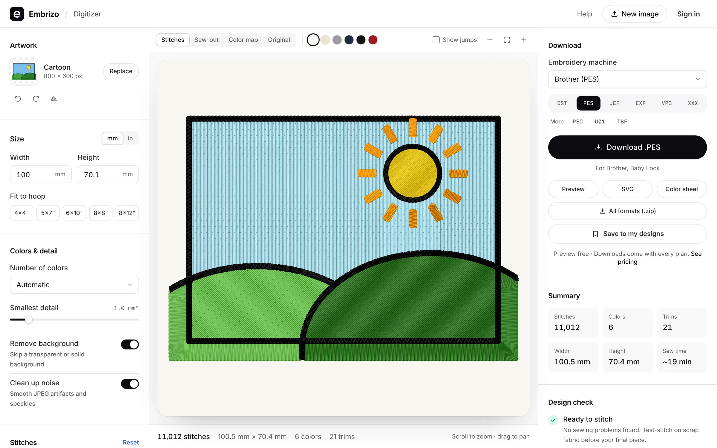
Embrizo's digitizer has a Fill angle setting that is either Auto or a fixed angle. On Auto, each fill is sewn at the angle that splits it into the fewest sections, and neighboring colors alternate between 45° and 135° so they catch the light differently.
- Upload the artwork to the digitizer and set the width you'll sew, since angles and edges only make sense at the real size.
- Pick the fabric preset. Woven starts at 0.4 mm fill spacing, 3.5 mm stitches and 0.2 mm pull compensation per side. Knit uses 0.43 mm spacing and 0.3 mm pull compensation with heavy underlay, and Leather 0.5 mm spacing and 0.1 mm pull compensation with light underlay.
- Leave Fill angle on Auto for most logos, and look at the stitch preview to see the direction each color got.
- Choose a fixed angle when you want every fill in one direction, such as one calm direction across a set of filled letters, or rows kept diagonal to the ribs of a knit.
- Check the color list. It shows the stitch types each color came out in, such as Fill or Satin + Split satin, before anything is downloaded, and any color can be switched to Auto, Fill, Satin or Outline there.
What it doesn't do: a fixed angle is one setting for the whole design, not one per color, and each fill is sewn in one straight direction. It doesn't turn the angle inside a shape or make contour or motif fills, so leaves and fur that need the rows to follow their growth are a job for desktop software or a professional digitizer. Two-tone shapes usually still get contrast on Auto from the alternating angles.
The fill stitch digitizing page shows the angles on real sew-outs. Digitizing and previews are free with an account; downloading files needs a plan.