 Free toolThread color palette generatorBuild a color palette from a color or theme and get matching Brother and Janome thread codes.Open the tool
Thread color is where a good design can go flat. A gold that looked rich on screen disappears on a khaki cap, navy lettering vanishes on a black hoodie and a pastel palette blurs into white. Thread is shiny and reflects light differently from fabric and from a screen, and the fabric itself becomes one of the colors in the design.
This guide covers choosing threads for the fabric color, how many colors to use, contrast for small text and 14 palettes that work. The thread names come from Brother's 61-color embroidery thread chart, the same color names Brother machines use. Other brands have close equivalents, and the Brother to Janome chart converts between them.
Start with the fabric color
The fabric is the biggest color in the design, so choose thread against it. The difference that matters most is value, how light or dark a color is, rather than hue.
| Fabric | Threads that stand out | Threads that get lost |
|---|---|---|
| White or cream | Prussian Blue, Black, Red, Emerald Green, Royal Purple | Cream Yellow, Light Lilac, Silver, Lemon Yellow |
| Black | White, Deep Gold, Lemon Yellow, Sky Blue, Orange | Dark Gray, Prussian Blue, Dark Brown, Deep Green |
| Navy | White, Deep Gold, Silver, Light Blue, Orange | Black, Ultramarine, Royal Purple, Dark Gray |
| Heather gray | Black, Prussian Blue, Red, Dark Fuchsia | Silver, Gray, Warm Gray, Light Blue |
| Khaki or tan | Dark Brown, Prussian Blue, Deep Green, Black, White | Khaki, Beige, Light Brown, Brass |
| Red | White, Black, Cream Brown | Carmine, Vermilion, Deep Rose, Reddish Brown |
| Forest or kelly green | White, Deep Gold, Cream Brown, Black | Moss Green, Teal Green, Emerald Green, Dark Olive |
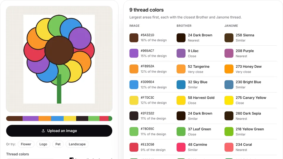
Each color in the thread color list shows the closest Brother and Janome threads and the colors it pairs well with.
How many colors to use
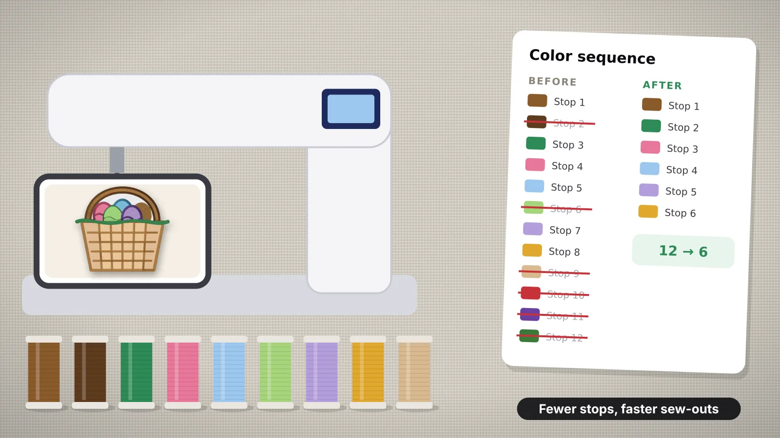
Most designs look strongest with 3–6 colors. Each extra color is another thread change, more trims and, on a single-needle machine, another stop to rethread.
| Design | Colors | Why |
|---|---|---|
| Name, monogram or one-line text | 1–2 | Clean and quick; a second color can be a thin outline |
| Left chest or cap logo | 2–4 | At small sizes, more colors blur together |
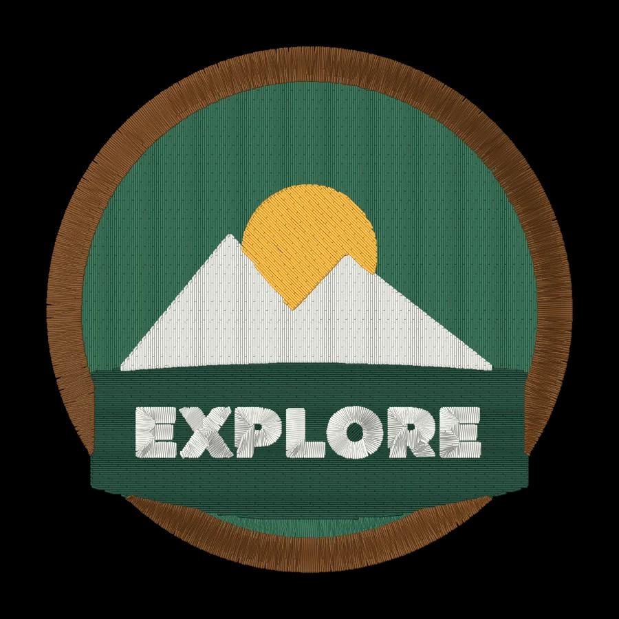
| Patch | 3–6, plus the border | Enough for a picture, with a bold edge |
| Floral or illustration | 4–6 | Two greens, two flower colors and an accent cover most designs |
| Photo-style portrait | 8–12 | Needs more shades, with more stitches and changes to match |
Tone-on-tone, such as Pewter on a charcoal polo or Ultramarine on navy, reads as premium on workwear and caps. Pick a thread one or two shades lighter or darker than the fabric, so the logo shows on a closer look without shouting.
Try it with your own design
Sign up free, upload an image and get a stitch preview in under a minute.
Drop your image here
PNG, JPG, SVG, PDF or AI · stays on your device
Not sure what to expect? See real examples or how it works.
Value contrast for text and small details
Colors with different hues but similar lightness, such as Red and Emerald Green, look lively together in a large design but blur at small sizes, and text in them is hard to read. Lettering under about 10 mm (0.4 in) tall needs strong light-dark contrast with whatever is behind it.
- Do the grayscale test. Turn the design to grayscale on your phone or in an image editor. If two neighboring colors become the same gray, they'll merge from a few feet away.
- Light on dark, or dark on light. Use White, Cream Brown or Lemon Yellow text on dark fabric, and Black, Prussian Blue or Dark Brown on light fabric.
- Separate similar values with an outline. A 1–1.5 mm satin border in Black or White keeps red lettering readable on green.
- Avoid mid-tones for fine lines. Gray, Khaki and Warm Gray outlines disappear on mid-tone fabrics such as heather gray and tan.
For tiny lettering, stroke width matters as much as color; the small text guide gives the minimum sizes.
14 thread color palettes that work
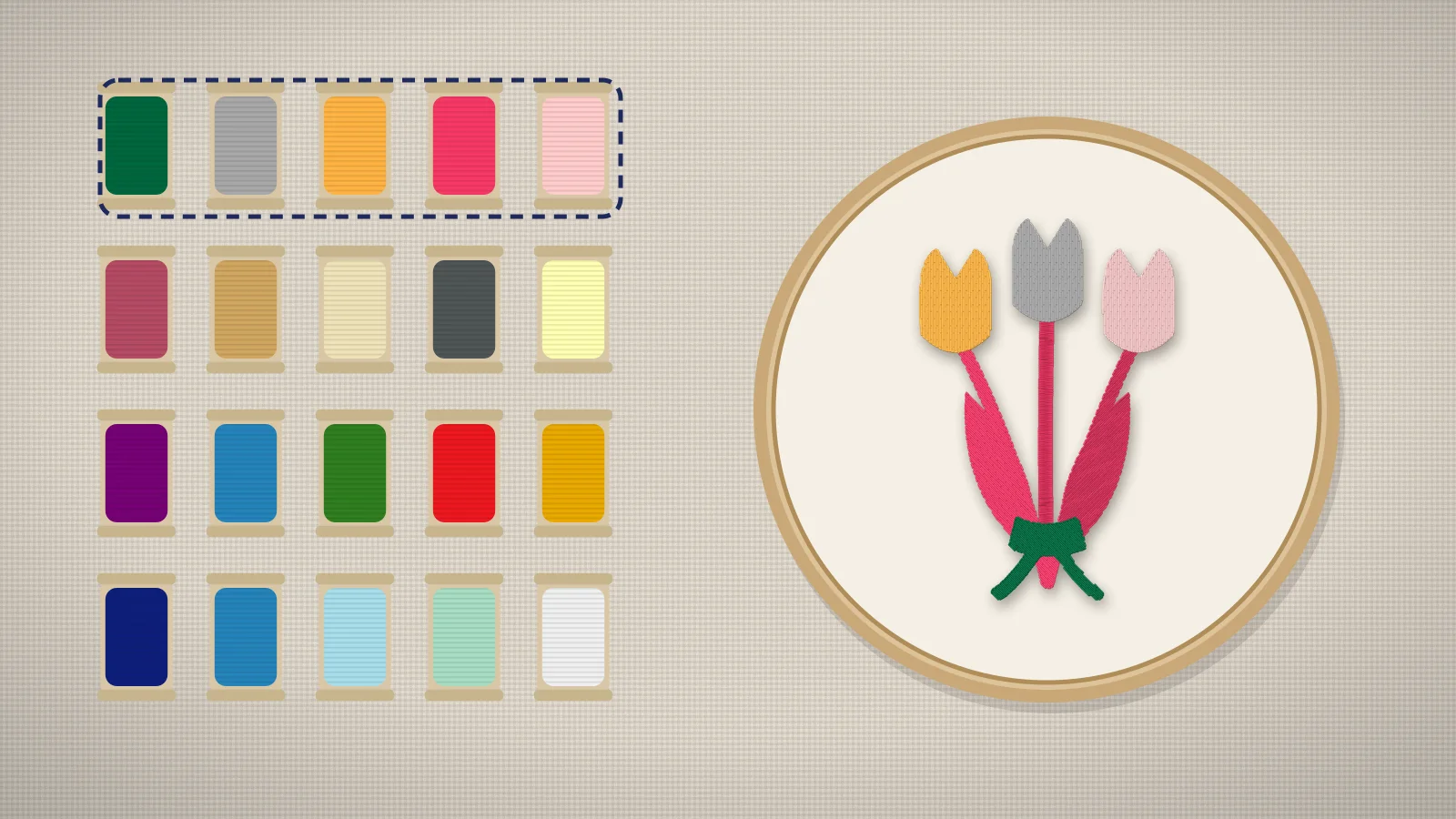
These palettes use thread names from Brother's 61-color chart. Each has a dark, a light and one or more accents, with the fabrics it suits.
| Palette | Brother threads | Best on | Tips |
|---|---|---|---|
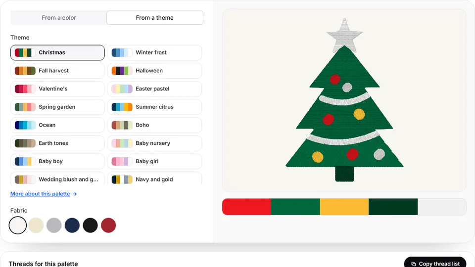
| Classic Christmas | Red, Deep Green, White, Deep Gold | White, cream or natural canvas | Letter in White on red or Red on white, not red on green |
| Winter snow | White, Light Blue, Sky Blue, Silver | Navy or charcoal | Keep snowflake arms at least 1 mm wide |
| Fall harvest | Clay Brown, Pumpkin, Deep Gold, Dark Olive, Dark Brown | Cream, oatmeal or khaki | Dark Brown for stems and lettering |
| Halloween | Orange, Black, Royal Purple, Lime Green | White or light gray; on black, swap Royal Purple for Lilac | Black outlines tie the colors together |
| Pastel nursery | Light Blue, Mint Green, Salmon Pink, Cream Yellow, Pewter | White or light gray | Pastels vanish on white without a Pewter outline or name |
| Baby girl | Pink, Light Lilac, White, Pewter | Pink, white or heather gray | Pewter keeps the name readable |
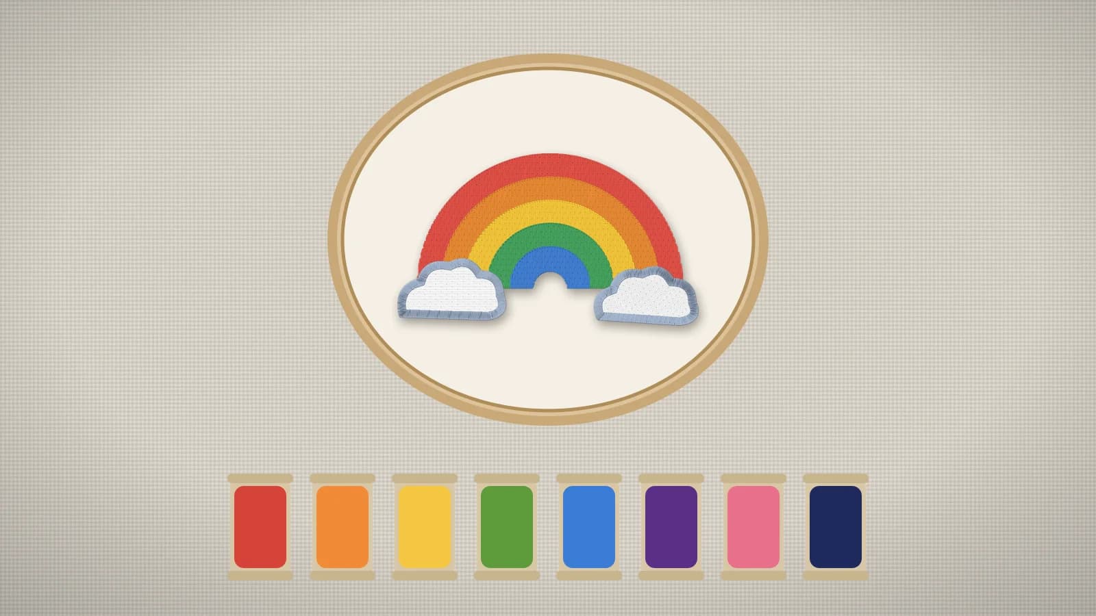
| Boho | Clay Brown, Deep Gold, Dark Olive, Beige, Light Brown | Natural canvas, cream or rust | Suits rainbows and suns on totes and sweatshirts |
| Ocean and nautical | Prussian Blue, Sky Blue, Seacrest, White, Red | White, cream or light blue | Use Red only as a small accent, such as a flag |
| Tropical | Teal Green, Salmon Pink, Lemon Yellow, Leaf Green | White or navy | On white, outline Lemon Yellow in Teal Green |
| Navy and gold team | Prussian Blue, Deep Gold, White | White or heather gray; on navy, use White and Deep Gold | The most legible school palette at small sizes |
| Red and black team | Red, Black, White, Silver | White or heather gray; on black, drop Black | Silver is a softer accent than White |
| Wedding blush | Flesh Pink, Salmon Pink, Warm Gray, Pewter | White or ivory linen | Pewter for names and dates, blush for florals |
| Earth tones and outdoors | Deep Green, Khaki, Dark Brown, Cream Brown, Deep Gold | Khaki, olive or tan canvas | Classic for camp patches and outdoor caps |
| Spring florals | Deep Rose, Pink, Lavender, Leaf Green, Moss Green | White or cream | Two greens give leaves depth without shading |
Embrizo's palette library collects more ready thread palettes by theme, with the matching thread names.
Matching brand colors
Brand colors come as hex, RGB or Pantone values, and no thread matches every one exactly. Pick the nearest thread, then check it in daylight:
- Get the exact values from the brand guidelines, such as hex codes or Pantone numbers.
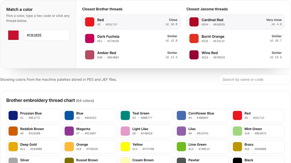
- Find the nearest threads in the thread color chart, or upload the logo to image to thread colors, which matches each color to Brother and Janome threads with codes.
- Compare the two or three closest matches. A color difference (ΔE) under about 2 is hard to see; above about 5 it's clear side by side.
- Check a real spool or a sewn swatch against the printed brand color in daylight, since screens and shop lighting both shift colors.
- Record the thread brand and number for each brand color, so every reorder uses the same threads.
Embrizo's digitizer matches each color in an uploaded logo to Brother or Janome threads automatically and lists them with the design. Thread color matching covers Pantone, lighting and switching thread brands in more depth.
Checking a palette before you stitch
- Build or test a palette with Embrizo's embroidery color palette generator, which builds a palette from a starting color or a theme and gives the matching Brother and Janome thread codes.
- See it on the garment. The mockup generator puts a digitized logo on a T-shirt, polo, hoodie, cap or tote at its real size, so you can try it on different garment colors.
- Preview the stitches. In the digitizer, the realistic stitch preview shows the design in its matched thread colors, and you can merge colors or change the stitch type per color before saving.
- Sew a color test on a scrap of the real fabric for important jobs; thread looks different under shop lights than it does on screen.
Practice on a free design
167 ready-to-sew designs in every machine format, free with an account.


Color mistakes to avoid
- Same-value neighbors. Red next to Emerald Green, or Royal Purple next to Prussian Blue, blur together without an outline.
- Thread that matches the fabric by accident. Deep Gold on a khaki cap or Dark Gray on a charcoal hoodie loses the design. Tone-on-tone should be a choice.
- Too many similar shades. Three nearly identical blues mean three thread changes no one will notice. Merge them.
- Yellow text on white. Lemon Yellow and Cream Yellow lettering is nearly invisible on white; outline it or switch to Deep Gold.
- Metallic thread for small text. It's stiffer and breaks more easily, so keep it for larger accents, as the metallic thread guide explains.
- Forgetting the bobbin. On towels, blankets and anything seen from both sides, match the bobbin thread to the top thread or the fabric.