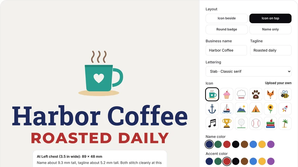
 Free toolEmbroidery logo makerMake a simple logo for shirts and caps from an icon, a name and a tagline, sized to stitch, then digitize it.Open the tool
This guide is for graphic designers and business owners creating a logo that will end up on polos, caps and work jackets. A logo that looks sharp on a screen can stitch as a blur, because thread has a width, stitches pull the fabric, and a left chest logo is only about 3.5 in (89 mm) across.
You'll get the sizes to design for, the minimum line, gap and letter sizes, how many colors to use, what to simplify, how to build a separate embroidery version, the files to hand over and how to check the design before anything is sewn. If the logo already exists and you only need to clean up the file, preparing artwork for embroidery is the shorter route.
What size will an embroidered logo be?
Design for the smallest size the logo will be stitched, which for most brands is a left chest logo about 3–4 in (75–100 mm) wide or a cap front about 2–2.25 in (50–57 mm) tall. Every detail has to survive at that size, so start there, not on a full-screen artboard.
| Placement | Typical size | What fits |
|---|---|---|
| Left chest | 3–4 in (75–100 mm) wide, up to about 3 in tall | A mark and a short name; text at least 5 mm tall |
| Cap front | 4–5 in (100–125 mm) wide, 2–2.25 in (50–57 mm) tall | A wide, short lockup; text at least 6–7 mm tall |
| Sleeve | 2.5–3.5 in (65–90 mm) wide | The mark alone or a one-word name |
| Cap back or back of neck | 2–3 in wide, about 1 in (25 mm) tall | One short line of bold capitals, such as a web address |
| Full back | 10–12 in (250–300 mm) wide | Nearly the full logo, still in flat colors |
The shape matters as much as the size. A wide, short logo fills a cap front, and a square or stacked logo suits a chest or a sleeve. A tall, narrow logo is the hardest case: held to 2.25 in tall on a cap, it ends up only an inch or so wide and its text gets tiny. The embroidery size chart lists every placement with its range.
Print the logo at 100% at 3.5 in wide and hold it at arm's length. If you can't read the smallest words or see a detail, thread won't show it either.
How thin can lines and letters be?
Keep every line, stroke and gap at least about 1 mm wide at the stitched size, and capital letters at least 5 mm (0.2 in) tall in a bold sans-serif. Below those sizes, satin stitches can't form a clean column and small gaps close up as the thread spreads.
| Element | Minimum at the stitched size | What happens below it |
|---|---|---|
| Lines and strokes | About 1 mm | Under about 0.75 mm they sew as a single running stitch line, or vanish |
| Gaps, and the holes in letters such as a, e and o | About 1 mm; more is safer | Thread spread closes them and letters turn into blobs |
| Capitals in a bold sans-serif | About 5 mm (0.2 in) | Strokes crowd together and letters fill in |
| Capitals on caps and piqué polos | About 6–7 mm | The curve and the knit texture swallow thin strokes |
| Serif fonts | About 7–8 mm | Serifs blob or disappear |
| Script fonts | About 8–10 mm or more | Thin joins between letters break up |
| Outlines around shapes | 1–1.5 mm, or none | Hairline keylines become wobbly runs that don't line up with the fill |
To check on screen, think in stitched millimeters. On a 1,000 px wide artboard standing in for a 3.5 in chest logo, 1 mm is about 11 px, so any stroke or gap narrower than that needs work. The small text guide explains why letters fill in, the lettering size calculator shows how tall a word comes out at a given width, and the embroidery fonts page shows 12 lettering fonts stitched, with their minimum sizes.
Wide shapes are fine. Areas wider than about 6.5 mm are sewn as a tatami fill and narrower ones as shiny satin, so a mix of bold shapes and medium strokes gives the logo texture and depth on fabric.
Try it with your own design
Sign up free, upload an image and get a stitch preview in under a minute.
Drop your image here
PNG, JPG, SVG, PDF or AI · stays on your device
Not sure what to expect? See real examples or how it works.
How many colors should an embroidered logo have?
Two to six flat colors suit most embroidered logos. Each color is a separate thread and a color change, and the design check in Embrizo's digitizer flags designs with more than 12.
- One color per area, no blends. Thread can't fade from one shade to another, so a gradient becomes two or three hard bands. Replace it with one solid color, or two flat tones with a clear edge.
- No shadows, glows or bevels. Each one becomes an extra color with ragged edges. The thread's own sheen adds the depth instead.
- Count the needles. A single-needle home machine stops for every color change. Multi-needle machines hold 6 to 15 or more threads, such as 6 on the Brother PR680W and 15 on the Ricoma MT-1501, so a logo with more colors than needles means rethreading in the middle of every piece.
- Give Pantone references. Thread makers such as Isacord and Madeira publish Pantone-to-thread charts, but the matches are approximate, so approve the real threads on a sample. The thread color chart compares Brother and Janome threads.
- Plan for dark and light garments. A one-color version, all white or all black, sews well on any shirt color, and tone-on-tone thread looks good on premium workwear.
Colors also drive cost. Every extra color adds a stop and often a trim, and shops price by stitches and machine time. The logo stitch estimator shows the colors, stitch count and run time of a logo at left chest and cap size, and thread color matching covers hitting brand colors in thread.
What should you simplify in a logo for embroidery?
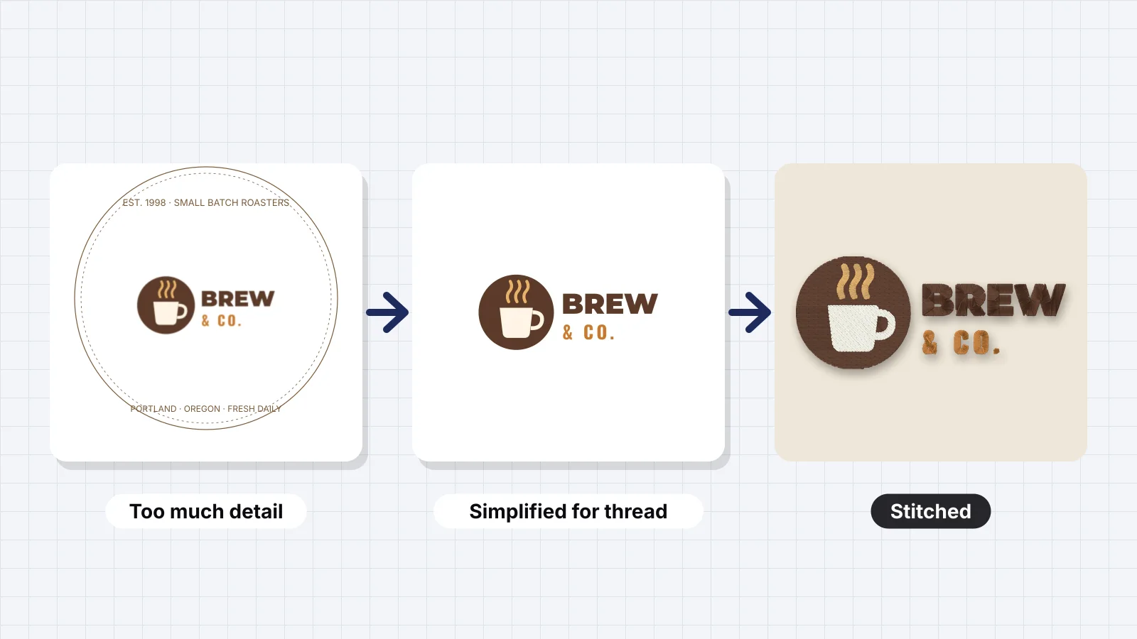
Remove or enlarge anything that's thinner, smaller or more detailed than thread can sew at the target size. That usually means the tagline, thin outlines, tiny symbols, gradients and textures. Most logos keep their identity, the shapes and colors people recognize, with far less detail than the print version.
| In the full logo | In the embroidery version |
|---|---|
| A tagline under the name | Drop it at chest and cap sizes, or move it to a sleeve or the back, where it can be 5 mm tall |
| A hairline outline around the mark | Remove it, or thicken it to a 1–1.5 mm border that sews as satin |
| A gradient or metallic sheen | One solid color, or two flat tones |
| A drop shadow or 3D bevel | Delete it |
| Halftones, hatching or a texture | Solid fills |
| A thin script with hairline joins | A bolder script, or the name in a bold sans-serif at small sizes |
| Small text inside a badge | Fewer words and bigger letters, sewn on top of the badge fill |
| A ® or ™ mark | Leave it off small placements if the brand allows, or enlarge it to about 4–5 mm |
| Many tiny separate shapes, such as dots or stars | Fewer, larger shapes; each separate shape can add a jump or a trim |
Many brands already have a simplified mark for favicons and social media avatars: fewer details, bolder lines and no tagline. It's often the best starting point for the embroidery version, and it keeps the stitched logo consistent with what customers see online.
How do you make an embroidery version of a logo?
Draw a separate artwork file for thread at the size it will be stitched, and keep it with the brand files next to the print logo. Designers call it the embroidery version or stitch version, and it saves every embroiderer from guessing what to drop.
- Start from the master vector in Illustrator, Affinity Designer or Inkscape, not from a PNG.
- Set the artboard to the stitched size: 3.5 in (89 mm) wide for a left chest, about 4.25 × 2 in (108 × 51 mm) for a cap front.
- Convert text to outlines, so the lettering can't change to another font on someone else's computer.
- Apply the simplifications: thicken strokes and open gaps to at least 1 mm, raise letters to the minimums above, drop the tagline and delete effects.
- Flatten the artwork: one solid fill per shape, strokes expanded into shapes, and no hidden or stray objects.
- Make the layouts you need. A horizontal lockup for caps and a stacked or mark-only version for chests and sleeves cover most uniforms.
- Name the colors with Pantone or thread numbers, in a note or the file name.
- Export an SVG and a PDF, plus a PNG with a transparent background at about 2,000 px across.
Label the files clearly, such as logo-embroidery-left-chest.svg and logo-embroidery-cap.pdf, so nobody stitches the print version by mistake.
Don't rely on one stitch file for every size. Scaling a stitch file more than about 10–20 percent changes its density and stitch lengths, so digitize the embroidery version separately for the chest, the cap and the back.
Which files should you give an embroiderer?
Give the embroiderer the embroidery version as a vector file (SVG, PDF, AI or EPS), plus the stitched size, the placement, the thread or Pantone colors and the garment color. With those, any shop or digitizer can make a stitch file that matches what you designed.
| File | What it's for | Notes |
|---|---|---|
| SVG | The best input for most digitizers | Opens directly in Embrizo; outline the text first |
| A universal vector format | Embrizo opens page 1, drawn at 2,000 px | |
| AI | Adobe Illustrator's own file | Opens in Embrizo when saved with Create PDF Compatible File, Illustrator's default |
| EPS | An older print-shop vector format | Browsers can't open it, so save it as PDF or SVG for Embrizo |
| PNG | A good fallback | Transparent background, 1,000–2,000 px across |
| JPG | A last resort | Compression noise around edges turns into stray colors |
| DST or PES | The finished stitch file, made by digitizing | Ask for it back and keep it for reorders; DST opens on most commercial machines |
A vector still isn't a stitch file. Digitizing adds the stitch types, underlay, pull compensation and sewing order, which is why shops often charge a one-time digitizing fee. Converting a PDF or Illustrator file to embroidery covers that step, and the logo to embroidery file page turns the artwork into a DST, PES or JEF. If all you have is a PNG, the PNG to SVG tool traces it into a vector you can clean up.
Practice on a free design
167 ready-to-sew designs in every machine format, free with an account.
How do you check the design before it's stitched?
Check the embroidery version at its real size with an image checker, then digitize it and watch the stitch preview, before anyone sews a sample. Problems are far cheaper to fix in the artwork than on 50 polos.
- Score the artwork. Upload a PNG or SVG to the embroidery image checker and pick Left chest or Cap front. It rates resolution, background, colors and fine detail at that size, flags shapes narrower than about 0.8 mm and estimates the stitch count.
- See it on a garment. The embroidery mockup generator digitizes the logo and shows it stitched on a polo, cap, T-shirt, hoodie or tote at its real size.
- Preview the stitches. Open the file in the digitizer, which takes SVG, PDF and AI files as well as PNG and JPG. Set the width, pick the fabric preset (knit for piqué polos, woven for caps and work shirts), read the design check and watch the sew-out animation.
- Fix the artwork, not the stitches, then check again. If one color should sew differently, the digitizer lets you set it to fill, satin or outline, or merge it into another color.
- Sew one sample on the real garment before the order.
What Embrizo does: it auto-digitizes the logo with underlay, pull compensation and lock stitches, matches threads to the Brother or Janome charts and writes DST, PES, JEF, EXP, VP3 and other formats. What it doesn't: it won't redesign the logo for you, since deciding what to drop is a brand decision, and it doesn't sequence files specifically for caps or make 3D puff. Digitizing and previews are free with an account; downloading files needs a plan.