The best fonts for embroidery are bold, simple and even. Thread has a width of its own, it pulls the fabric in as it sews, and it can't draw a hairline, so a font that looks elegant on screen can stitch out as a row of blobs. A font that sews well has strokes at least about 1 mm wide at the final size, a generous x-height and open counters, the holes inside letters such as a, e and o.
This guide covers what to look for, how small each style can go, how to pair fonts and which styles suit caps, towels and kids' items. To test lettering as you read, type a name into the text to embroidery tool and switch fonts and sizes until it reads cleanly in the stitch preview.
What makes a font stitch well
Five things decide whether lettering survives the trip from screen to thread:
- Even, solid strokes. Lettering is usually sewn as satin columns, which need strokes about 1 mm wide or more. Fonts that mix thick and thin strokes lose the thin parts first.
- A tall x-height. That's the height of lowercase letters such as x, a and e. A tall one keeps lowercase readable at small sizes.
- Open counters. Thread spreads slightly, so holes smaller than about 1 mm close up and the letter reads as a blob. Round, open letters hold up best.
- Simple shapes. Fine serifs, swashes, inline stripes and distressed textures are too small to stitch at most sizes.
- Room between letters. Spacing that looks right on screen often makes letters touch in thread, so add a little.
Pre-digitized lettering, the fonts built into machines and embroidery programs, already follows these rules. Any other font is just outlines, so it's digitized like artwork, and its thinnest stroke decides how small it can go.
Minimum sizes by font style
| Font style | What it looks like | Minimum capital height | Best for |
|---|---|---|---|
| Block (bold sans-serif) | Heavy, even strokes, no serifs | About 5 mm (0.2 in) | Names on shirts, bags, caps and workwear |
| Varsity | Heavy slab serifs, often with an outline | About 6–8 mm (0.25–0.3 in) | Team names, numbers and sportswear |
| Condensed | Narrow, tall capitals | About 5–6 mm (0.2–0.25 in), if strokes stay 1 mm wide | Long names on sleeves, collars and cap backs |
| Serif or slab serif | Classic letters with serifs | About 7–8 mm (0.3 in) | Monograms and traditional logos |
| Script | Connected, flowing strokes | About 10–12 mm (0.4–0.5 in) or more | Towels, gifts, baby items and weddings |
| Retro or display | Bold scripts and chunky headline fonts | About 10 mm (0.4 in) or more | Shop names and vintage-style logos |
| Thin or decorative | Light weights, hairline serifs, textures | Avoid under about 20 mm (0.8 in) | Large designs only |
These are capital heights on flat, stable fabric. Measure the lowercase too: if the x-height drops under about 4 mm, switch to all capitals or go bigger, and add 1–2 mm on piqué, fleece and towels. The small text guide covers stroke widths and counters in detail.
Judge a font at the size you'll sew, not zoomed in on screen. Print the word at actual size or set the real width in the preview. If a letter looks cramped there, it will look worse in thread.
Try it with your own design
Sign up free, upload an image and get a stitch preview in under a minute.
Drop your image here
PNG, JPG, WebP or SVG · stays on your device
Block, serif, condensed and script compared
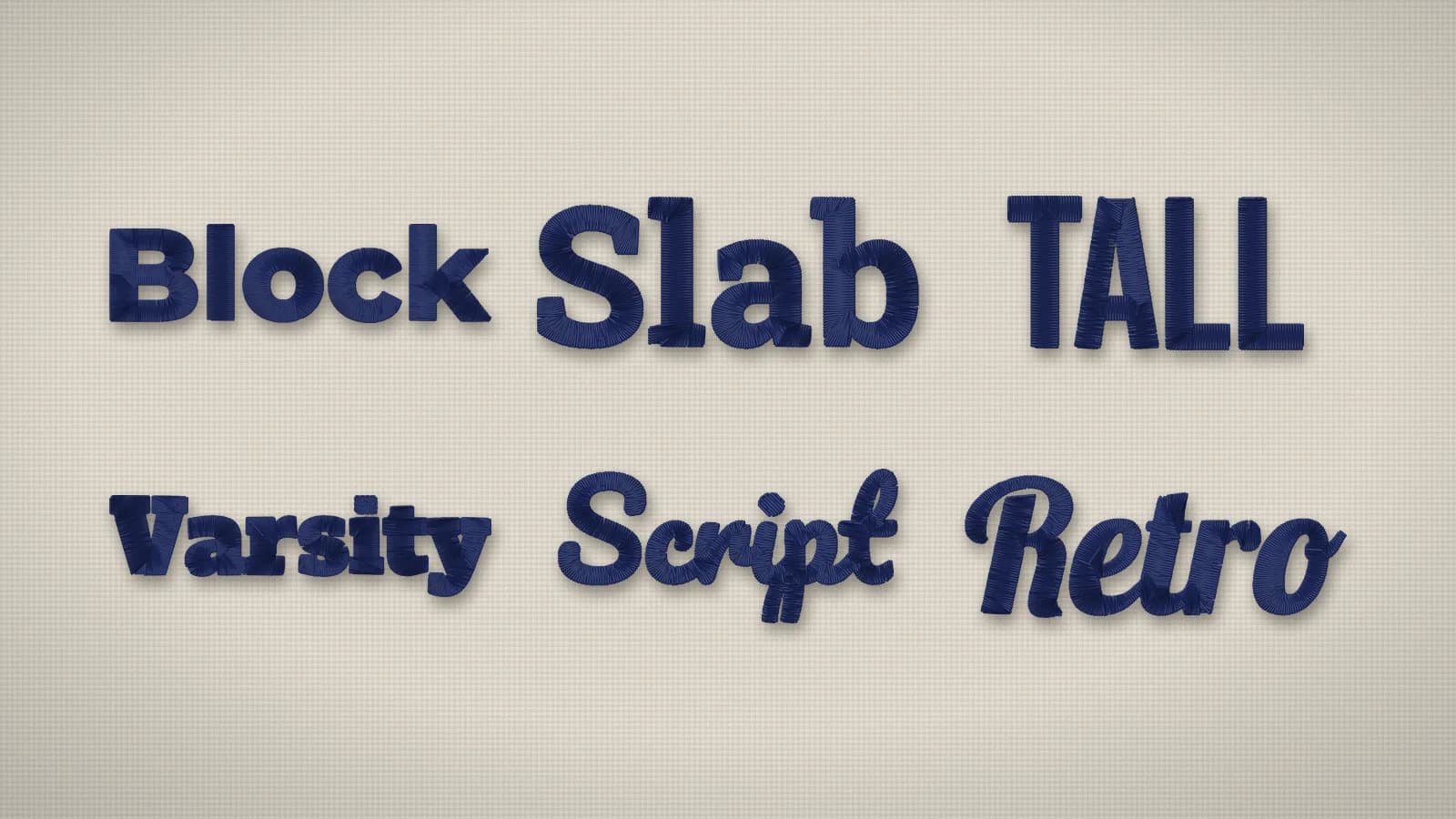
- Block. The workhorse. Even strokes sew as clean satin at almost any size and read from across a room. The safe default for workwear and anything small.
- Varsity. Heavy slab serifs survive in thread where fine serifs don't. Good for team names, numbers and college-style lettering, often outlined in a second color.
- Serif. Classic and formal, but serifs are the first thing to go. Pick one with chunky serifs, not hairline ones, and keep it around 8 mm or larger.
- Condensed. Narrow letters fit long names into tight spaces. The gaps between strokes get small, so choose a bold weight and add letter spacing.
- Script. Lovely on towels and gifts, but thin joins and tight loops need size. Choose a rounded, bold script, and don't set it in all capitals.
- Retro and display. Bold scripts and chunky headline fonts make good shop names at larger sizes. Inline stripes, shadows and distressing won't stitch.
Embrizo's 12 lettering fonts cover these styles: Block, Rounded and Sport for bold sans, Tall for condensed capitals, Slab, Varsity, Classic and Roman for serifs, and Script, Retro, Brush and Flowing for scripts. The embroidery fonts page stitches your own text in each one and shows the smallest size each font can be sewn.
Pairing fonts in one design
Two fonts are usually enough: one for the name or main word and one for a supporting line. A third rarely helps, and if each line has its own color, it's another thread change.
- Script over block. A script name above a small block tagline is the classic gift and shop layout.
- Contrast in weight or width, not detail. A bold condensed headline over a regular block line reads cleanly. Two decorative fonts fight each other.
- Give the smallest line the simplest font, the boldest and most open in the design, and keep it at least 5 mm tall.
- Leave space between lines. Lines set tight on screen run into each other in thread.
When lettering is part of a logo, digitize the whole design at once in the digitizer, so the text and artwork are sized together. The design check flags strokes narrower than about 0.8 mm, which is usually the supporting line, and suggests keeping lettering at least 5 mm tall.
Fonts for caps, towels, kids' items and more
| Item | Font style | Letter height | Why |
|---|---|---|---|
| Cap front | Block or Varsity, all capitals | At least 6–7 mm | The thick, curved front swallows thin strokes |
| Left chest and workwear | Block or a bold condensed | About 5–10 mm | Reads at a glance, and the tagline stays legible |
| Sleeve or collar | Condensed | About 6–10 mm | Fits long names into a narrow strip |
| Towels and robes | Bold script or block | About 25 mm (1 in) or more | Loops hide thin strokes; use a water-soluble topping |
| Kids' items and baby gifts | A rounded sans or a soft, bold script | About 15 mm or more | Friendly shapes; light stitching stays soft on baby knits |
| Monograms | Serif, script or block | About 50–75 mm on towels and pillows, 25–40 mm on shirts | Large letters let classic styles shine |
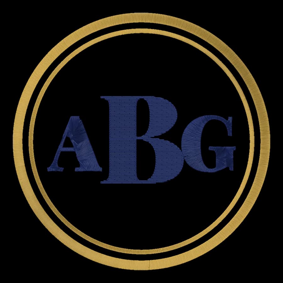
For a classic three-letter monogram with a frame, the monogram maker sets the layout and letter sizes for you.
Checking lettering before you sew
- Set the final size first. Every rule above depends on it.
- Find the smallest letter, usually a lowercase e or the tagline, and check its height and stroke width.
- Look for closed counters and letters that touch. Add spacing or choose a bolder font.
- Pick the fabric preset, so knits and fleece get heavier underlay and more pull compensation.
- Sew a test on scrap fabric with the same stabilizer, and read it from arm's length.